
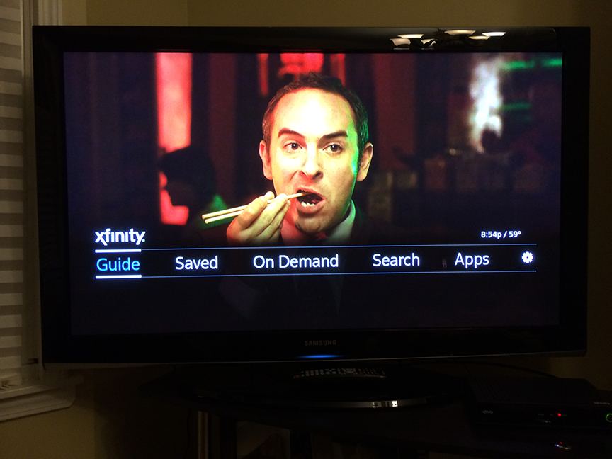
At home I have the new Xfinity cable/DVR boxes. They just updated their User Interface. One of the things they did, which I felt was really good, is that all the menu items are simply larger and more legible on screen. Also, whenever your “cursor” is on top of something it magnifies it a bit. That part of the experience is really good.  But they have totally missed the boat on thinking about this from the end user’s standpoint. 99% of the time I go into the menus it’s because I want to watch a show recorded on the DVR. You have to go through 2 menu levels and clicking at least 2 or 3 different buttons on the remote before you can get to the list of shows. Why do they make it so hard? TiVo is brilliant on this front. To get to your shows, you click the same button twice and there you are. I wish more consumer products companies designed like TiVo.
Apr
27
27